


In this design study of a Historic Victorian and Italianate kitchen, we look at how Expressive Plum behaves when brushed and sprayed onto tall, ceiling-height inset cabinetry with glass-front upper hutches and stepped crown cornices. With a Light Reflectance Value (LRV) of 11, this shade sits firmly at the dark end of the spectrum. It absorbs a great deal of light, yet its balance of deep plum, muted purple, and cool gray undertones prevents it from reading like a flat black hole.
Here in Columbus, Indiana, as late autumn settles into early winter, the afternoon sun drops low and sends long, cool shafts of daylight through oversized arched sash windows. In that crisp midday light, the cool gray backbone of Expressive Plum steps forward, calming the purple so the perimeter cabinets read as a dignified, smoky aubergine. To keep the eleven-foot ceiling height feeling buoyant rather than heavy, this first visualization pairs the plum cabinetry with surrounding plaster walls and ornate ceiling medallions painted in Sherwin-Williams Pure White (SW 7005). Pure White has just enough neutrality to keep the contrast clean without turning stark or clinical against original heart-pine strip flooring.
How Satin Enamel and Hardware Interact on Inset Joinery
Expressive Plum
Sherwin-Williams SW 6271
Pure White
Sherwin-Williams SW 7005
Fawn Brindle
Sherwin-Williams SW 7640
Cast Iron
Sherwin-Williams SW 6202
Painting fine cabinetry is a very different optical game than rolling flat latex onto drywall. When you apply a dark shade like Expressive Plum in a durable satin or semi-gloss cabinet enamel, the physical profile of the woodwork changes how the color reads from foot to foot. Looking closely at the rendering of the joinery below, you can see how the satin sheen catches the low-angle November window light along the sharp bevels of the inset shaker stiles, rails, and drawer fronts. While the recessed center panels hold onto a velvety, shadowed plum, the raised edges reflect a soft silver-violet highlight that emphasizes the craftsmanship of the doors.
See Expressive Plum on Your Own Walls in 15 Seconds
Sherwin-Williams SW 6271 • LRV 11 • #695C62
Because Expressive Plum carries a cool gray undertone beneath its purple core, it requires thoughtful pairing with stone and metal so it does not turn chilly during the winter months. In this close-up study, we paired the satin cabinetry with honed marble countertops that carry warm taupe and violet-gray veining. That subtle echo of purple in the natural stone bridges the gap between the dark wood base and the bright work surface. For hardware, unlacquered cast brass bin pulls and latches are the natural companion here. Yellow gold and aged brass sit opposite purple on the color wheel, meaning the warm metal makes the plum look richer and more deliberate, while the dark cabinet face makes the brass gleam without feeling flashy.

Anchoring the Centerpiece Island and Butler’s Pantry with Deep Contrast
As late afternoon transitions early into the evening hosting hours of November and December, natural daylight fades and the kitchen relies on warm 2700K amber light from dining chandeliers and recessed fixtures. Under incandescent or warm LED bulbs, the cool gray in Expressive Plum steps back, and the deep plum undertones warm up considerably, taking on a cozy, wine-dark richness that suits pre-holiday gatherings.
In a large Victorian layout where a centerpiece island or an adjoining butler’s pantry needs a grounded partner, pairing Expressive Plum with a dark neutral creates a sophisticated, furniture-like distinction. In the visualization of the butler’s pantry below, the tall upper hutch and lower drawers remain in Expressive Plum, while the contrasting centerpiece island base in the foreground and the pantry's lower wine bar zone are anchored in Sherwin-Williams Cast Iron (SW 6202). Cast Iron is a deep, charcoal-black with a subtle organic green-gray undertone. Placing Cast Iron on the island base or adjacent millwork gives the eye a neutral dark anchor, allowing Expressive Plum to read clearly as an intentional heritage color rather than just a generic dark paint.

Transitioning into Adjoining Millwork and Study Bookcases
Historic Italianate homes rarely have open-concept floor plans; instead, they flow through tall pocket doors and wide cased openings from the kitchen into parlors, libraries, and mudroom passages. When you use an LRV 11 shade like Expressive Plum on your primary kitchen millwork, the adjoining rooms need a bridge color that respects the weight of the cabinetry without repeating the purple everywhere.
In this rendering looking through the pocket doors into an adjacent study and mudroom transition, the custom floor-to-ceiling bookcases and bench lockers carry the Expressive Plum enamel forward, while the surrounding walls and 10-inch profiled baseboards shift into Sherwin-Williams Fawn Brindle (SW 7640). Fawn Brindle is a weathered, mid-tone greige with a distinct cool taupe and slight green-gray cast. It picks up the muted gray undertone inside Expressive Plum, creating a calm, earthy backdrop that keeps the transition between rooms seamless. Against Fawn Brindle walls and original oak flooring, the plum bookcases feel integrated into the historic shell of the house.

Tailored Elegance on a Primary Bath Vanity
If you love the composure of Expressive Plum on wood joinery but aren't ready to commit an entire kitchen perimeter to a dark palette, a historic bathroom vanity or dressing room built-in is an ideal place to start. Smaller jewel-box spaces in Victorian homes thrive on rich, furniture-grade millwork.
In this final design study of a tailored bathroom vanity, Expressive Plum is applied in a moisture-resistant semi-gloss enamel over an inset furniture-style cabinet with turned legs and a solid base profile. Surrounded by walls in Fawn Brindle and crisp trim in Pure White, the vanity holds its lines under the warm glow of brass wall sconces. The cooler purple-gray undertones keep the vanity from feeling muddy next to polished marble hex tile, proving that this heritage shade is just as capable in an intimate dressing room as it is across a grand kitchen.

When evaluating Sherwin-Williams Expressive Plum for your own cabinetry, always sample it directly on a primed wood offcut in the exact satin or semi-gloss enamel you plan to use, and watch how it shifts from the cool window light of midday to the warm amber glow of your evening fixtures.
Complementary Color Consultation
Planning a project? Work with Torlando Hakes directly as your personal Color Designer and get a Complementary Consultation when purchasing paint through us.
Expressive Plum (SW 6271) — Key Questions Answered
What is the LRV and undertone of Sherwin-Williams Expressive Plum (SW 6271)?
Sherwin-Williams Expressive Plum (SW 6271) has a Light Reflectance Value (LRV) of 11 and hex code #695C62. Always evaluate it under both north-facing and warm afternoon light before final application.
What trim and coordinating colors pair best with Expressive Plum?
Our recommended architectural pairings for Expressive Plum include Pure White (SW 7005), Fawn Brindle (SW 7640), Cast Iron (SW 6202) to balance wall depth, trim contrast, and adjoining room transitions.
How can I test Expressive Plum on my own walls before painting?
You can upload a photo of your room to Craftsman Painter's Color Studio AI to preview Expressive Plum on your walls immediately, or schedule an on-site or video consultation with our team.
Getting Expressive Plum Right Under Your Home's Light
Join 1,650+ homeowners, designers, and architects receiving our curated dispatches every 10 days (1st, 11th & 21st) on field stories, LRV, undertones, and trim pairings.
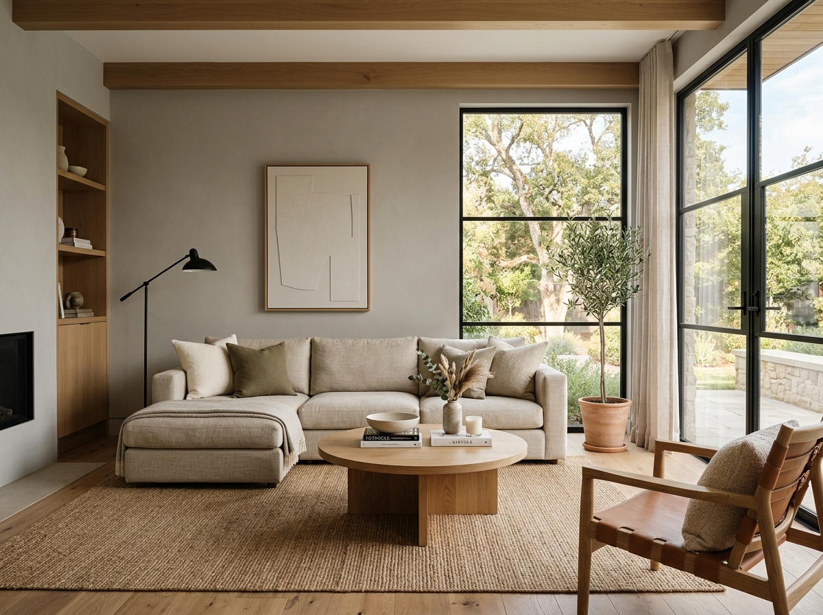 After
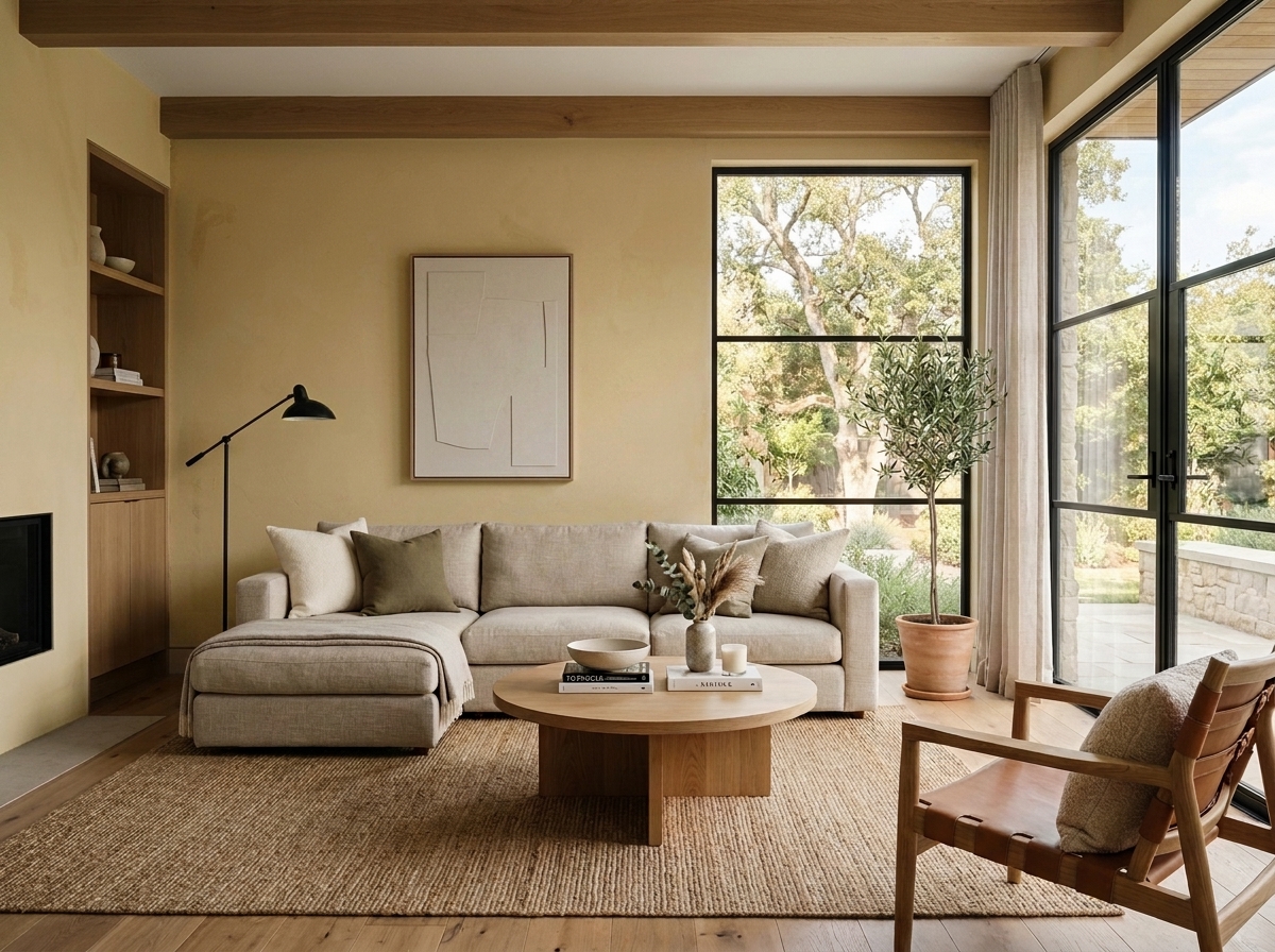 Before
Visualize Your Space with Color Studio AI
Planning a project? Skip the paint chip guesswork. Use our Color Studio AI to instantly visualize these paint colors on your own walls, or take advantage of our aligned contractor pricing matching current Sherwin-Williams retail promotions.
Book Your Upcoming Paint Project
Craftsman Painter is now scheduling premium transformations. Reserve an on-site consultation or instant video walkthrough.
Get an Estimate →Related Color & Design Studies

The Case for Quiet Gray-Blues: Why Designers Return to Sherwin-Williams Languid Blue SW 6226
The Muddy, Magnificent Paint Color Designers Keep Secretly Hoarding to Tame the Brutal Bloomington Sun

When Golden Daylight Needs a Cool Counterweight, Could Sherwin-Williams North Star SW 6246 Be the Answer?
Help Others Find Professional Color Insights
Share this story directly to your networks or copy the link to share with friends.