



With a Light Reflectance Value (LRV) of 45.41, Pebble Beach sits just below the exact midpoint of the reflectance scale. It absorbs enough light to bring immediate visual weight and structure to a space, yet reflects enough light to prevent rooms from feeling enclosed. In places like Atlanta, where the high-overhead summer sun cuts through wide-plank glass and iron factory windows, bright daylight tends to wash out high-LRV whites and pale warm grays. Under this intense, direct illumination, Pebble Beach maintains its integrity. The heavy summer canopy of oak and pine outside casts cool green-reflected light inward, which activates the blue undertones in Pebble Beach, grounding the room in a cool, atmospheric wash.
In structural applications, I always emphasize sheen selection with mid-tone grays like Pebble Beach. On standard drywall, a flat or true matte finish allows the slate-blue pigments to diffuse evenly across the surface without specular reflection or sheen glare. For moisture-prone areas or high-traffic corridors, stepping up to a low-lustre eggshell maintains durability while keeping color drift to a minimum.
The Coordinating Palette: Architectural Harmony
Pebble Beach
Benjamin Moore 1597
Chantilly Lace
Benjamin Moore OC-65
Pale Oak
Benjamin Moore OC-20
Van Deusen Blue
Benjamin Moore HC-156
To build a cohesive architectural scheme around Pebble Beach 1597, you need a palette that respects its cool slate core while providing crisp framing and warm textural relief.

Work Directly with Torlando Hakes
Skip the color choice stress. Work directly with me as your personal Color Designer to select the perfect architectural palette for your home, and get a Complementary Color Consultation when you purchase paint through us.
- Benjamin Moore Chantilly Lace (OC-65)
- Role: Tier 1 Trim & Structural Anchor Neutral
- Application: Apply to door casings, window mullions, architectural baseboards, and ceiling crown in a Semi-Gloss or Satin finish. Chantilly Lace has virtually zero chromatic bias, offering a ultra-clean, high-contrast frame that prevents Pebble Beach’s blue undertones from looking muddy.
- Benjamin Moore Pale Oak (OC-20)
- Role: Tier 2 Mid-Tone Bridge Neutral
- Application: Apply to adjoining open-concept hallways, contiguous ceilings, or plaster transition zones in a Matte or Flat finish. Pale Oak acts as a soft greige warm bridge, softening the contrast between raw industrial elements like exposed concrete and the cooler main wall color.
- Benjamin Moore Van Deusen Blue (HC-156)
- Role: Tier 3 Contrast Accent
- Application: Apply to custom kitchen islands, built-in library millwork, or solid interior doors in a Fine Satin or Satin finish. As a historic deep navy, Van Deusen Blue picks up on the slate core of Pebble Beach and anchors the lower sightlines of large rooms.

Designing within an Urban Industrial Framework
Consider a design study of an urban industrial loft conversion in Atlanta’s Historic Fourth Ward—a space dominated by structural concrete pillars, distressed red-brown brickwork, dark iron factory window grids, and raw wood beams. In an environment rich with heavy, warm, tactile building materials, warm walls can sometimes make the space feel muddy or visually cluttered.
By applying Benjamin Moore Pebble Beach 1597 to the primary drywall surfaces, the wall planes recede slightly, allowing the historic, tactile brick and heavy timber to pop forward. The cool gray tone creates a deliberate architectural boundary against the red oxide tones of burnt clay brickwork.

When applying trim, running Chantilly Lace OC-65 along the sharp casings creates a distinct, continuous boundary between the glass openings and the wall field. The high-reflectance trim pulls the intense summer daylight deep into the interior footprint, creating clean lines that frame the raw architectural elements.
Managing Dynamic Light Shifts
One of the defining qualities of Pebble Beach 1597 is its sensitivity to solar orientation and light intensity. Because its LRV sits at 45.41, the shade changes dramatically throughout the day.

In morning light, when natural light hits at a low angle, Pebble Beach reveals a soft, silvery slate appearance. As midday approaches and intense overhead summer sun floods through expansive glass, the gray pigments absorb the excess glare, maintaining visual comfort without reflecting blinding white light back into the seating areas. On walls cast in gentle interior shadow, the blue undertones deepen, giving the surface a structural, stone-like presence that pairs naturally with concrete ceilings or dark iron fixtures.
By pairing this wall plane with a ceiling coated in Benjamin Moore Pale Oak OC-20 in a flat ceiling finish, you soften the overhead boundary. Pale Oak diffuses secondary bounce-light back down into the room, ensuring that even under shadow conditions, the room feels open and balanced.

Accent Millwork and Spatial Transitions
When specifying contrast elements for custom millwork or architectural joinery, sticking within the same chromatic color family prevents visual chaos. Using Benjamin Moore Van Deusen Blue HC-156 on lower built-in elements—such as a central kitchen island or custom pantry door—establishes a strong visual baseline.
The deep, grounded navy of Van Deusen Blue complements the light slate-gray field of Pebble Beach. The darker cabinetry grounds the lower third of the room, allowing the eye to drift naturally toward the raw ceiling beams and tall iron-grid windows. Under warm 2700K artificial light from industrial pendant fixtures or exposed Edison filaments in the evening, this color pairing transitions from a crisp daytime look into a moody, sophisticated setting.

In smaller, enclosed secondary spaces like a powder room or vanity alcove, Pebble Beach demonstrates its versatile nature. When applied in an eggshell finish alongside warm reclaimed wood vanities and polished concrete tiles, the color reads as a modern slate tone. The slightly higher sheen level bounces artificial mirror lighting cleanly off the surface while resisting humidity, showing that a sophisticated cool gray can bring quiet authority to functional spaces.
Before committing to a full application of Pebble Beach 1597, paint a large 3x3-foot poster board card and observe it at 9:00 AM, 2:00 PM, and 8:00 PM under your room's specific lighting. How the slate-blue undertones react to your local sun exposure and artificial lamps will tell you everything you need to know about setting the final sheen and trim contrast.
Featured Color Palette

Benjamin Moore Pebble Beach (1597) — Featured Craftsman Painter color selection.

Benjamin Moore Chantilly Lace (OC-65) — Featured Craftsman Painter color selection.

Benjamin Moore Pale Oak (OC-20) — Featured Craftsman Painter color selection.

Benjamin Moore Van Deusen Blue (HC-156) — Featured Craftsman Painter color selection.
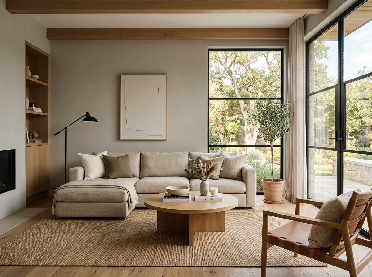 After
After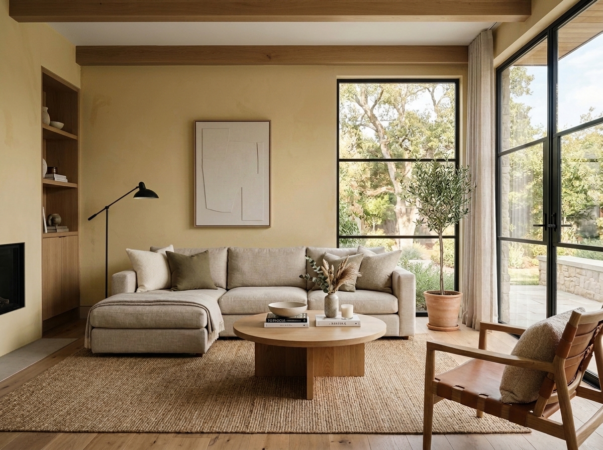 Before
Visualize Your Space with Color Studio AI
Planning a project? Skip the paint chip guesswork. Use our Color Studio AI to instantly visualize these paint colors on your own walls, or take advantage of our aligned contractor pricing matching current Sherwin-Williams retail promotions.
Book Your Upcoming Paint Project
Craftsman Painter is now scheduling premium transformations. Secure your spot and elevate your property value.
Get an EstimateHelp Others Find Professional Color Insights
Share this story directly to your networks or copy the link to share with friends.