


Unpacking Classic Gray's Subtle Cream-Yellow Undertone
Real-paint peel-and-stick samples ship via Samplize. Craftsman Painter may earn a small commission on sample orders at no extra cost to you.
The most common misstep homeowners make with Classic Gray is failing to fully appreciate its underlying warmth. Many approach it expecting a pure, unadulterated gray, and then become confused when it shifts on their walls. This soft cream-yellow undertone is not always immediately apparent in every light condition or on a small swatch. Instead, it reveals itself as a gentle warmth that prevents the color from leaning into blue, purple, or green territory—common pitfalls of many grays. In south-facing rooms with abundant warm light, Classic Gray’s yellow notes may become more pronounced, presenting as a very light greige or even a soft off-white. Conversely, in north-facing rooms or spaces with cooler, indirect light, the gray will assert itself more, but the underlying cream-yellow still functions to keep it from feeling icy. This inherent warmth makes Classic Gray an excellent choice for creating cohesive whole-house palettes, as it provides a consistent, inviting neutral that avoids the starkness often associated with cooler grays. Understanding this undertone is critical for predicting how the color will behave in your specific environment and ensuring it aligns with your desired aesthetic.
The Imperative of Isolated Color Testing
Selecting a paint color, especially one as nuanced as Classic Gray, demands a disciplined approach to testing. A frequent error I observe is homeowners taping small swatches directly onto an existing painted wall. This method is inherently flawed due to the principle of simultaneous contrast, famously explored by Josef Albers. When two colors are viewed side-by-side, each influences the perception of the other. Your existing wall color, no matter how neutral you perceive it to be, will distort your perception of Classic Gray. A cool existing wall might make Classic Gray appear warmer than it truly is, while a warm wall could make it seem cooler.
To accurately evaluate Classic Gray, you must isolate it. My recommendation is to procure real-paint, peel-and-stick samples. Place these samples on a large white poster board or, ideally, directly against your existing white trim. This provides a neutral context, allowing the color's true undertones and LRV to reveal themselves without interference. Observe the samples throughout the day under varying natural light conditions—morning, midday, and evening—and also under your typical artificial lighting. Pay close attention to how the cream-yellow undertone manifests. This diligent testing process, free from simultaneous contrast, is the only reliable way to confirm if Classic Gray will achieve the desired effect in your home. For further guidance on color selection and testing, our Color Studio offers resources to help you make informed decisions.
Perfect Pairings and Professional Finish Standards
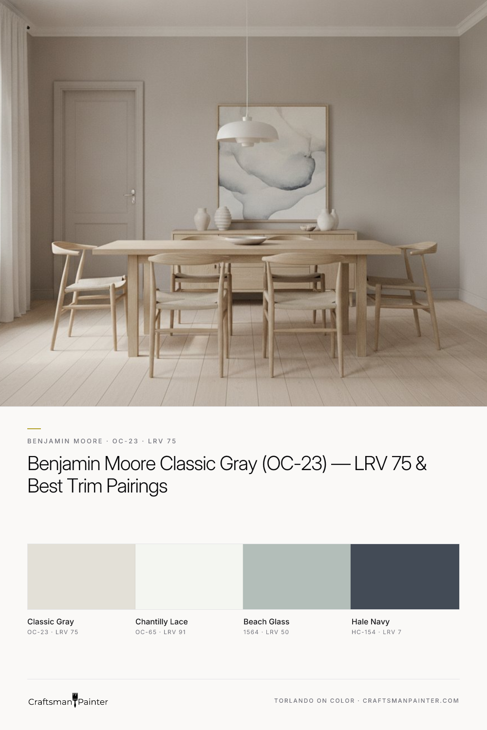
Classic Gray's versatility shines when paired with the right complementary colors and applied with professional-grade preparation. For trim and ceilings, Benjamin Moore Chantilly Lace (OC-65, LRV 91) is an impeccable choice. Its pristine, pure white quality provides a crisp, clean contrast that allows Classic Gray's subtle warmth to truly emerge without any competing undertones. This pairing creates a sophisticated, understated elegance that is both fresh and timeless.
To build a cohesive palette, consider Benjamin Moore Beach Glass (1564, LRV 50) as a coordinating neutral. This muted blue-green offers a gentle, calming presence that complements Classic Gray's warmth without clashing. For a dramatic accent, Benjamin Moore Hale Navy (HC-154, LRV 7) provides a deep, grounding contrast. This rich, classic navy can be introduced on an accent wall, cabinetry, or in textiles to add depth and sophistication to a room featuring Classic Gray.
Achieving the optimal appearance for Classic Gray also depends heavily on the quality of surface preparation and coating application. For interior walls, particularly in luxury finishes, I recommend Level 3: Premium drywall preparation. This ensures a perfectly smooth, uniform surface that allows the subtle nuances of Classic Gray to be fully appreciated. For coatings, Sherwin-Williams Cashmere Low Lustre or Emerald Interior Matte are excellent choices for drywall, offering a refined finish that enhances the color's depth. In humid areas like bathrooms and kitchens, Sherwin-Williams Duration Home provides superior moisture resistance and washability. For trim, doors, and cabinetry, Sherwin-Williams Emerald Urethane Trim Enamel in Satin or Semi-Gloss delivers exceptional durability and a smooth, elegant finish that stands up to daily wear. The choice of sheen is critical here; a higher sheen on trim will reflect more light, creating a crisp delineation against the matte finish of the walls, amplifying the contrast and visual interest. For personalized guidance on your specific project, consider a 1-on-1 Color Consultation.
Classic Gray's Closest Rivals: Pale Oak and Sherwin-Williams Drift of Mist
When homeowners are drawn to Classic Gray's particular character, they often also consider similar shades. Two frequent contenders are Benjamin Moore Pale Oak (OC-20) and Sherwin-Williams Drift of Mist (SW 9166). While all three share a light, warm neutral appeal, their undertones and overall presence differ in important ways. Classic Gray, with its LRV of 75, is the lightest of the three, presenting as a soft, warm gray with a distinct cream-yellow undertone. It often reads as a very light greige or even a warm off-white, particularly in bright light. Its gray component is subtle, making it highly adaptable.
Pale Oak (OC-20), with an LRV of 69.89, is slightly darker and possesses a more pronounced greige character. Its undertones lean more towards a soft beige-taupe, giving it a touch more depth and a slightly warmer, earthier feel than Classic Gray. Where Classic Gray whispers warmth, Pale Oak speaks it a bit more clearly, making it a good choice for those who want a discernible greige without going too dark. It can sometimes show a very faint pinkish-beige undertone in certain lighting conditions, which Classic Gray typically avoids.
Sherwin-Williams Drift of Mist (SW 9166), with an LRV of 69, is comparable to Pale Oak in lightness but diverges in its undertone. Drift of Mist tends to have a very subtle green-gray undertone that, while not overtly green, keeps it from feeling as warm as Classic Gray or as earthy as Pale Oak. It’s a beautifully soft, muted greige that can read as a true light gray in some lights and a very soft off-white in others, but that hint of green-gray is its defining characteristic. If you want to avoid any yellow or taupe notes and prefer a slightly cooler, yet still soft, neutral, Drift of Mist might be the preferred option. Understanding these subtle distinctions is essential for selecting the precise nuance that best aligns with your home's fixed elements and desired atmosphere.

Can a High-Reflectance White Feel Soft Instead of Sterile? The Case for Benjamin Moore Frostine AF-5

Can a Violet-Tinted Gray Calm the Warmth of Mid-Century Stone and Walnut? Testing Sherwin-Williams Swanky Gray (SW 6261) in an Indiana Limestone Ranch Bath Suite
