
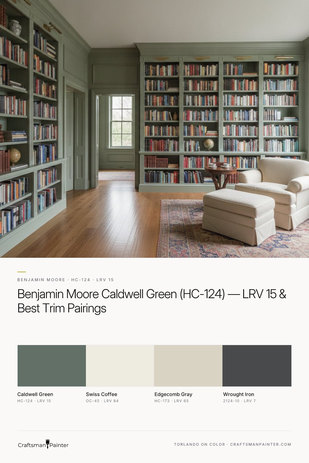


Decoding Caldwell Green's Complex Character
Real-paint peel-and-stick samples ship via Samplize. Craftsman Painter may earn a small commission on sample orders at no extra cost to you.
At its core, Benjamin Moore Caldwell Green (HC-124, Hex #627067) is a dark green-gray, but its defining characteristic is the subtle yet distinct blue undertone that emerges under certain lighting conditions. This isn't a straightforward forest green or a simple sage. Instead, it possesses a chameleon-like quality. In rooms with cooler, north-facing light, the blue undertones can become more pronounced, lending it a slightly muted, almost slate-like quality. Conversely, in warmer, south-facing light, the green asserts itself more strongly, appearing richer and more saturated. Artificial lighting, particularly LED bulbs with higher Kelvin temperatures, can also pull out its cool blue-gray notes, while warmer incandescent light might emphasize its green-gray depth.
Evaluating Caldwell Green in your home requires a disciplined approach to avoid misjudgment. As Josef Albers meticulously demonstrated through his work on simultaneous contrast, the perception of a color is heavily influenced by the colors adjacent to it. Testing a paint swatch directly on an existing painted wall will inevitably skew your perception, as the surrounding color will alter how your eye interprets the new hue. To accurately assess Caldwell Green, I advise homeowners to acquire real-paint peel-and-stick samples, ideally 12x12 inches or larger. Adhere these samples to a white surface, such as a large piece of poster board, or directly against existing white trim in your room. This isolation provides a neutral context, allowing the color's true undertones to reveal themselves without interference. Observe the sample at different times of day and under various lighting conditions to fully grasp its dynamic nature.
Navigating LRV 15: Light, Space, and Application
With a Light Reflectance Value (LRV) of 15, Benjamin Moore Caldwell Green sits firmly in the darker spectrum of colors. This low LRV means it absorbs a significant amount of light rather than reflecting it, creating a deep, enveloping effect. The implication for your space is profound: in rooms with abundant natural light, Caldwell Green can feel luxurious and sophisticated, grounding the space without making it feel heavy. Large windows or open concepts benefit from its ability to add dramatic depth while still feeling expansive. However, in smaller rooms or those with limited natural light, Caldwell Green can create a cozy, intimate, and even somewhat moody atmosphere. This can be a desirable outcome for a powder room, a study, or a formal dining area where a sense of enclosure is welcomed.
Proper surface preparation and coating selection are paramount when working with a color of Caldwell Green's depth. Imperfections on walls are more readily apparent with darker, light-absorbing colors. For most residential applications, a Level 2: Standard (Occupied Home) drywall preparation is sufficient, ensuring seams are taped and finished smoothly. For a truly pristine finish, particularly in luxury settings, I recommend a Level 3: Premium (Luxury Finish) preparation, which involves skimming the entire surface to achieve a glass-smooth substrate. For wall coatings, I often specify Sherwin-Williams Cashmere Low Lustre for its rich, velvety appearance, or Emerald Interior Matte for enhanced washability and durability, especially in high-traffic areas. In humid environments like bathrooms and kitchens, Sherwin-Williams Duration Home provides excellent moisture resistance and mildew protection. For further exploration of color characteristics like LRV, our Color Studio offers detailed insights.
Strategic Pairings: Trim, Accents, and Avoiding Color Clashes
Pairing Caldwell Green effectively involves selecting complementary colors that allow its depth to shine without creating visual discord. The right trim, coordinating neutrals, and accent colors elevate the entire scheme.
For trim and ceilings, Benjamin Moore Swiss Coffee (OC-45, Hex #EEECE1, LRV 84) is an exceptional choice. This soft, warm off-white provides a gentle yet crisp contrast to Caldwell Green. Unlike a stark, cool white, Swiss Coffee's subtle warmth prevents the palette from feeling cold, allowing Caldwell Green to maintain its inviting depth. For baseboards, doors, and interior cabinetry, I recommend Sherwin-Williams Emerald Urethane Trim Enamel in Satin or Semi-Gloss. This coating provides a durable, smooth finish that resists chipping and yellowing, critical for high-use surfaces.
As a coordinating neutral, Benjamin Moore Edgecomb Gray (HC-173, Hex #D9D3C4, LRV 65) works beautifully. This warm, versatile greige offers a sophisticated transition in adjacent rooms or open-concept layouts. Its inherent warmth and subtle gray undertones prevent it from competing with Caldwell Green, instead creating a harmonious flow that feels intentional and balanced.
For a dramatic contrast accent, Benjamin Moore Wrought Iron (2124-10, Hex #494A4B, LRV 7) is an impactful choice. This deep, near-black provides a striking counterpoint to Caldwell Green, suitable for a focal wall, interior doors, or even exterior accents. The intensity of Wrought Iron against Caldwell Green creates a sense of gravitas and modern elegance. Successfully integrating such a sophisticated palette often benefits from expert guidance. Consider a 1-on-1 Color Consultation for tailored advice on your specific project and lighting conditions.
Distinguishing Caldwell Green from Its Closest Competitors
While Benjamin Moore Caldwell Green stands out for its unique blend of dark green-gray with blue undertones, it’s helpful to compare it to similar popular shades to understand its precise character. Two notable rivals are Sherwin-Williams Pewter Green (SW 6208) and Farrow & Ball Pigeon (No. 25).
Sherwin-Williams Pewter Green (SW 6208) is often perceived as a more direct green-gray. While it shares a similar depth, it typically presents as a truer, less complex green. Pewter Green generally lacks the distinct blue undertone that Caldwell Green can reveal, making it appear slightly warmer and less mutable in varying light. Caldwell Green's blue influence lends it a subtle coolness and a more muted, almost historic elegance that Pewter Green doesn't quite capture. If you're seeking a straightforward, earthy green-gray without significant cool shifts, Pewter Green might be your preference. However, if you appreciate a color that offers more intrigue and a hint of unexpected blue-gray sophistication, Caldwell Green is the stronger contender.
Farrow & Ball Pigeon (No. 25) is another highly regarded sophisticated green-gray, but it leans more distinctly into a soft, muted blue-gray territory. Pigeon often appears dustier, softer, and more ethereal than Caldwell Green. Its blue-gray component is more prominent and consistent, giving it a gentle, almost chalky quality that is characteristic of Farrow & Ball's traditional finishes. Caldwell Green, in contrast, retains a more pronounced green identity, even with its gray and blue influences. It offers a richer, more saturated feel compared to Pigeon's somewhat softer, more atmospheric presence. For a robust, deep green-gray with a clear, earthy presence and subtle cool shifts, Caldwell Green is the choice. For a lighter, more overtly blue-gray with a delicate, soft appeal, Pigeon is more appropriate.
Benjamin Moore Caldwell Green is a masterclass in sophisticated color, offering depth, versatility, and a nuanced character that rewards careful consideration. Its ability to shift between a rich green and a cool blue-gray, coupled with its commanding LRV, makes it a powerful tool for creating spaces that feel both grounded and exceptionally refined. Approach its selection with diligence, and Caldwell Green will deliver a truly distinguished aesthetic to your home.
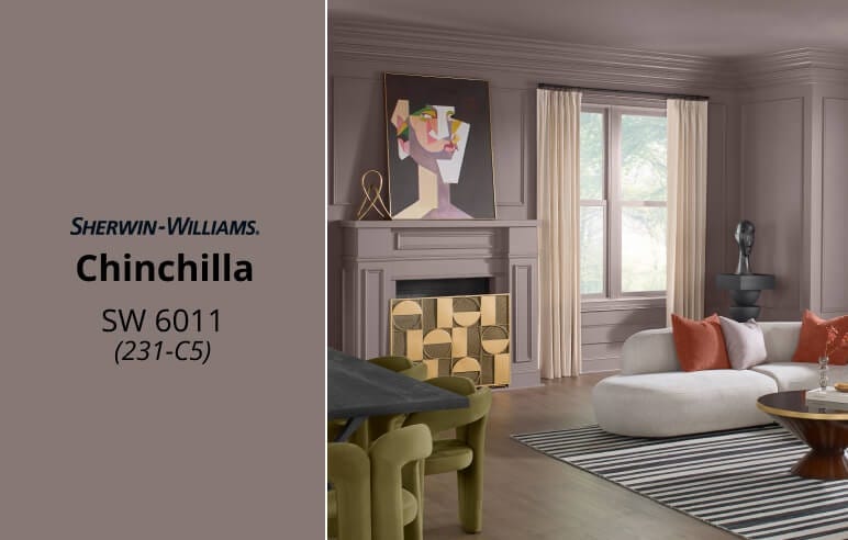
Chinchilla: Sherwin-Williams’ November Color of the Month

The 18th-Century Paint Color Secretly Saving Vancouver Kitchens From the Gray
